Creating Layouts for your Page
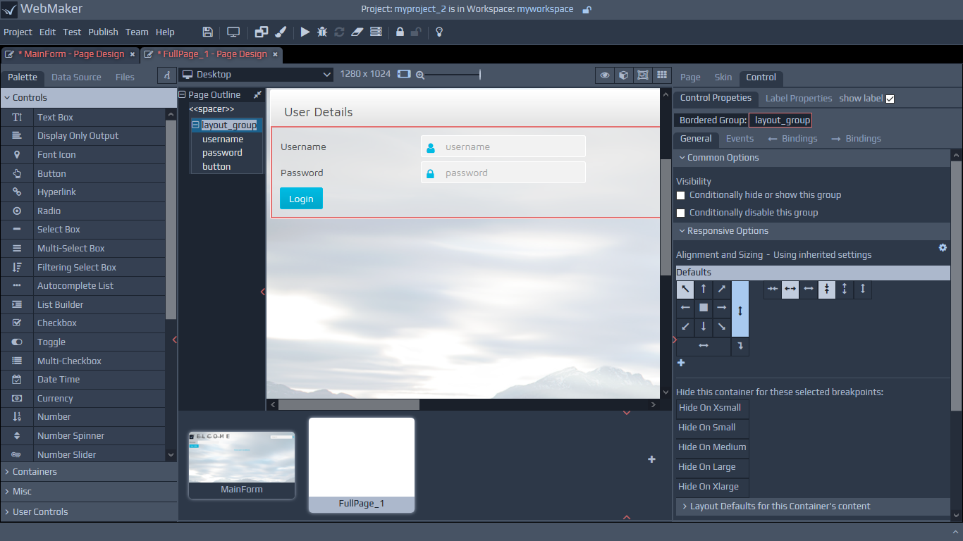
Most of the common options behave in a very similar manner to the primitive controls. The differences in behaviour are related to the fact that groups are containers, and many of the alignment settings apply to their contents. In addition, you will notice options on the alignment palette for distributing content horizontally and vertically. You can also indicate whether to wrap contents that overflow. Most of the layout and sizing options will appear under the Responsive Options section.
Please see the earlier section on Responsive Layout and Control Properties within the Getting Started section for details on groups and their role as containers, including information on labels, etc.
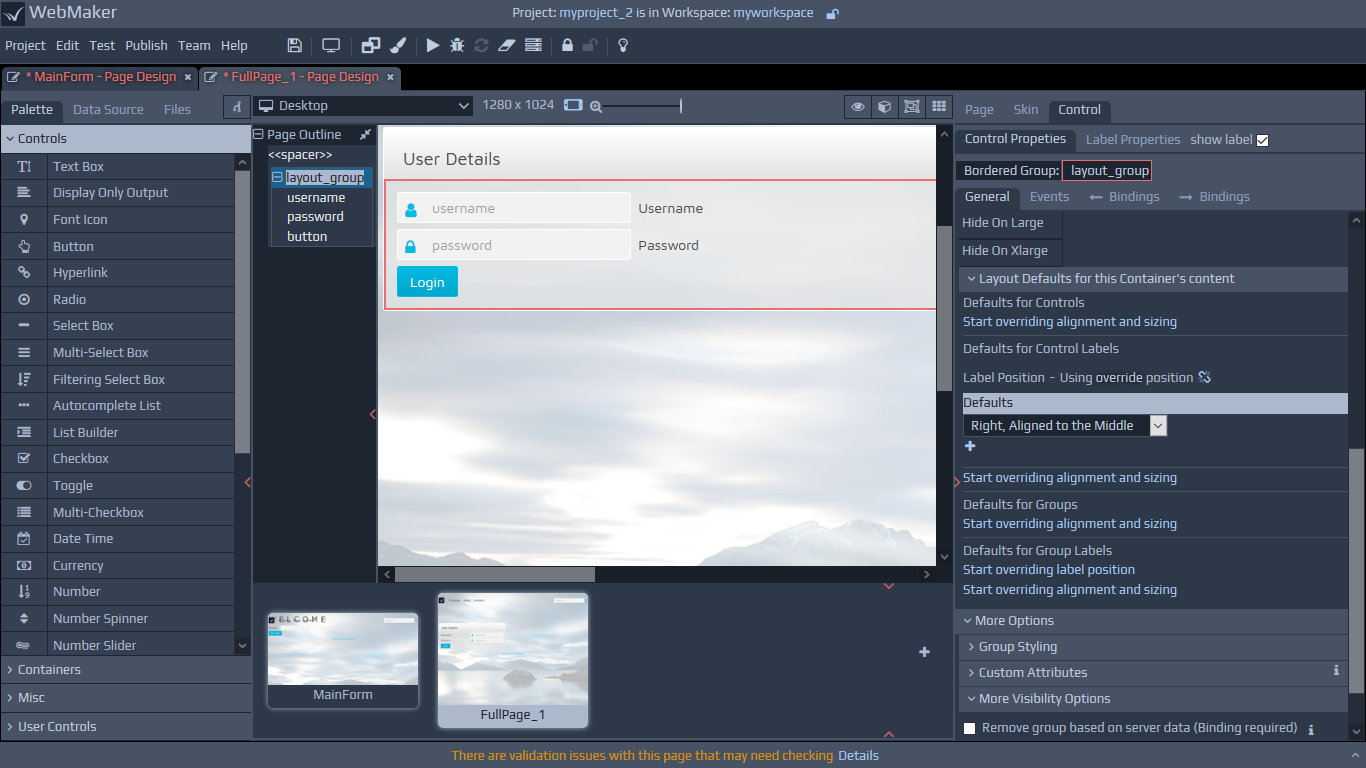
Layout Defaults for Container Content
Groups are often used to layout data elements, which might flow horizontally, vertically or in table format. In these scenarios, you may want the labels for the controls, which are contained in these groups, to be on top, on the left, etc.
You can override the application wide defaults for the layout setting by adjusting the parameters within the Responsive Options section of the Properties panel.
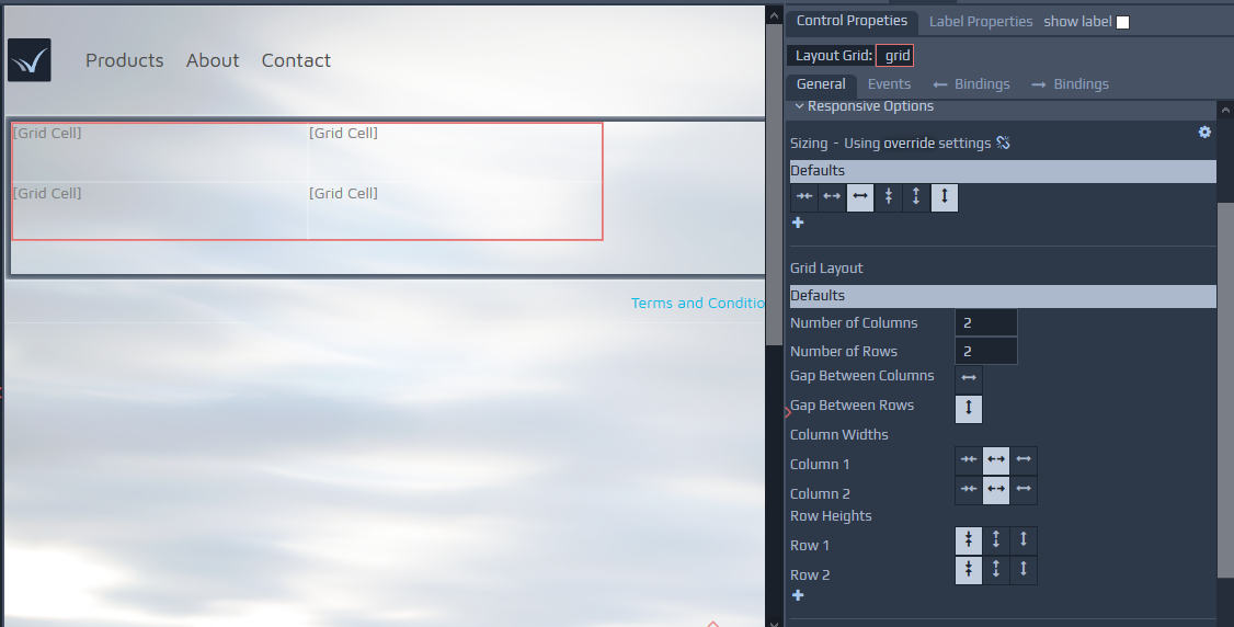
Layout Grid
The Grid control can be configured using a number of rows and columns. Each cell can contain other controls, including Layout Groups and other grids.
 The grid contains options to merge and split cells and options for the addition and removal of rows and columns. You can use the right-click context menu to access most options. Grids, together with Layout Groups, are central to managing responsive layouts in WebMaker. Grids have a special view for their creation, manipulation and responsive behaviour. You can enable this mode by selecting the Editable Grid View option on the top strip above the page canvas. In this mode, all content except the grid is dimmed, allowing you to focus on the design of the grid layout.
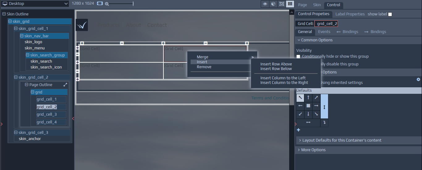 When applying certain breakpoint overrides for responsive layouts, shaded cells represent cells which will not be visible on certain devices.
The earlier section on Responsive Layout and Control Properties within the Getting Started section provides additional details on the various responsive options that are available, including layout and visibility of cells on different devices.
When applying certain breakpoint overrides for responsive layouts, shaded cells represent cells which will not be visible on certain devices.
The earlier section on Responsive Layout and Control Properties within the Getting Started section provides additional details on the various responsive options that are available, including layout and visibility of cells on different devices.
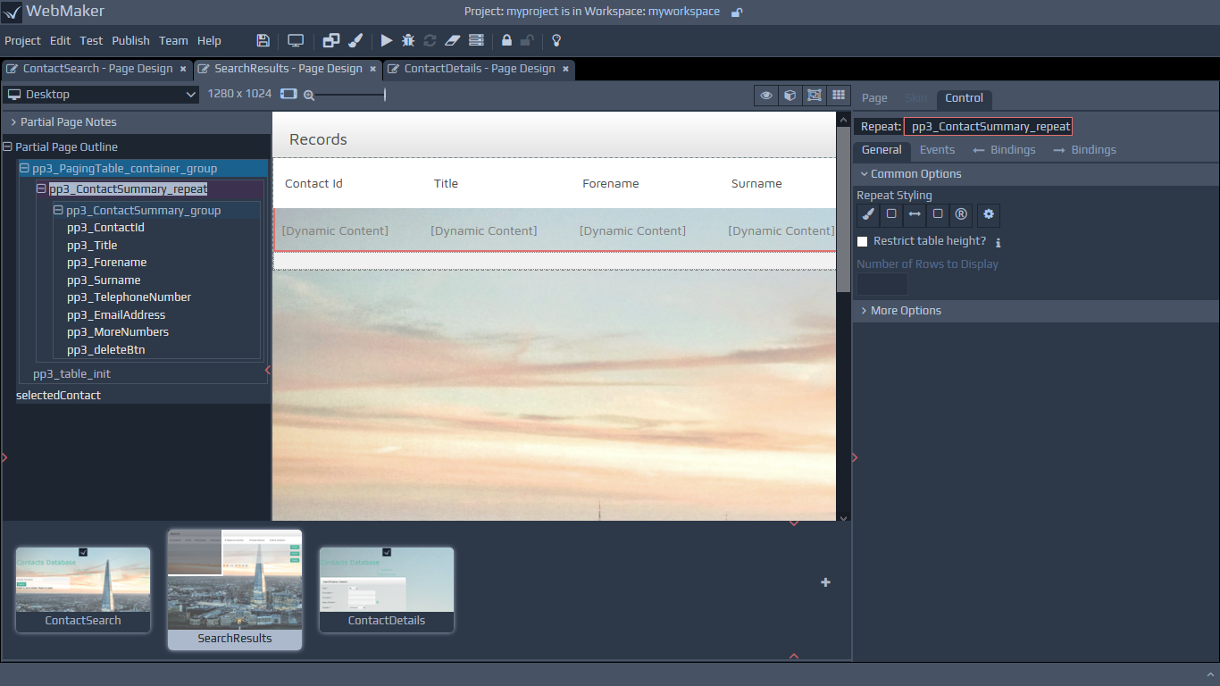
Table within Repeats
Within Repeating Tables, the labels of the contained fields or groups are used as table column headings and the field controls are placed in rows, with a number of rows being determined by the size of the data.
Group Visibility
You can hide, show and disable complete groups of information by using the Visibility options. This operates in a similar manner to the visibility options for controls. You can learn more within the Visibility section in Controls - Common Options.
The following are the common visibility options for groups:
Conditionally hide or show this group - As previously discussed in relation to field visibility, this option allows you to configure conditions, based on the values of other items, to determine when groups should be visible or hidden.
Conditionally disable or enable this group - This option allows you to configure conditions, based on the values of other items, to determine when groups should be disabled or enabled.
Please see the Visibility section under More Options for additional visibility settings.